When to use the categorical palette
Use the Turas categorical colour palette to show different categories of information that do not have an inherent order or value. The colours in this palette:
- stand out clearly from each other
- are easy to recognise
- imply no hierarchy
- are free from reliance on red and green contrast
- represent a broad range of hues
- are differentiated by lightness, rather than relying on colour alone
This categorical palette contains 6 colours. It has a strict alternating light/vibrant mid-tone and deep-base dark anchor pattern. This means charts will still work even if all colour is completely stripped away.
When used in the order presented:
- all adjacent colours have a contrast ratio of at least 3:1
- all adjacent colours appear distinct to users with colour vision differences
- all adjacent colours appear distinct in greyscale
The categorical palette
Always lead with colour 1 – Dark blue which is Turas dark blue.
1 - Dark blue
Hex: #122B45
RGB: 18, 43, 69
2 - Bright blue
Hex: #0095EB
RGB: 0, 149, 235
3 - Dark pink
Hex: #7A1A50
RGB: 122, 26, 80
4 - Orange
Hex: #E36D0D
RGB: 227, 109, 13
5 - Dark green
Hex: #004D00
RGB: 0, 77, 0
6 - Light purple
Hex: #9F81CF
RGB: 159, 129, 207
Background colours
Each colour has a contrast ratio of at least 3:1 against white (#FFFFFF) and Turas light grey (#F7F8FD). Data visualisations should only sit on these approved solid backgrounds. Avoid textured, patterned or dark backgrounds, as they reduce the intended colour contrast.
Text colour combinations for the categorical palette
Where possible, avoid placing text directly on categorical palette colours. Text is generally more readable when placed on a neutral background outside the coloured area. If space is limited, use the following colour combinations.
White: #FFFFFF
1 - Dark blue
Hex: #122B45
RGB: 18, 43, 69
Deep black: #030303
2 - Bright blue
Hex: #0095EB
RGB: 0, 149, 235
White: #FFFFFF
3 - Dark pink
Hex: #7A1A50
RGB: 122, 26, 80
Deep black: #030303
4 - Orange
Hex: #E36D0D
RGB: 227, 109, 13
White: #FFFFFF
5 - Dark green
Hex: #004D00
RGB: 0, 77, 0
Deep black: #030303
6 - Light purple
Hex: #9F81CF
RGB: 159, 129, 207
Applying the categorical palette
Always apply colours in a consistent, fixed order. Do not reorder them between charts showing the same categories.
Limit the number of categories to keep charts readable. As a guide, aim for no more than 6 categories when using the categorical palette. Do not skip colours in the sequence, as this breaks the intended contrast pattern.
If your data contains more than 6 categories:
- group smaller categories into ‘Other’ where appropriate
- consider using a different chart type instead of extending the palette
Do not use the categorical palette for ordered, continuous or high–low comparisons. These need sequential or diverging palettes.
Use transparency where colours overlap
Too much transparency can make charts difficult to read. To keep overlapping data visible:
- use 20% to 35% opacity for fills
- use full opacity for the outline
Provide a plain text alternative
Every chart should include a plain text version that explains its main message. This could be a data table or a brief written summary.
When using a data table:
- place it behind a toggle if your website or application supports that pattern
- include the table in the page content if a toggle is not available
- provide a separate link to the data where needed
Tables should use clear column headings, consistent units and logical ordering that matches the chart. Where datasets are large or complex, provide a concise summary alongside the table to highlight the key insight.
Categorical palette example
The following example shows how the categorical palette can be applied in a column chart.
Staff headcount across major territorial boards
Highest recorded headcount figures for the five largest NHS Scotland regions (fictional data)
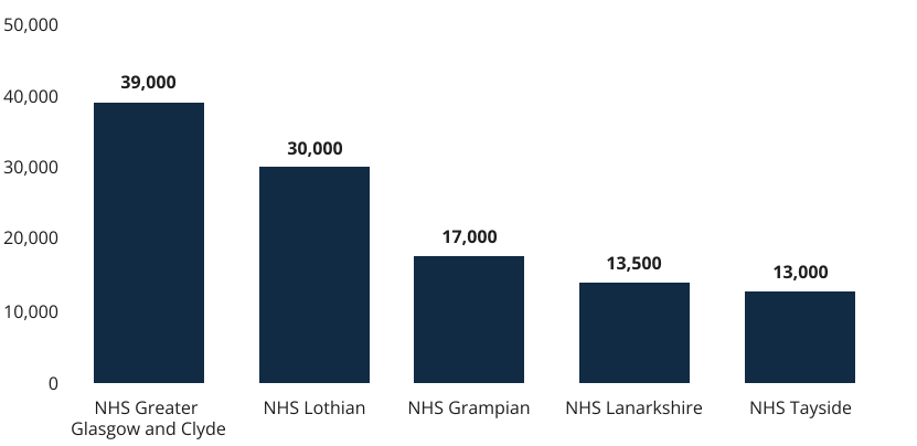
Figure 1. Example column chart
Example alt text
Helpful alt text focused on the key insight:
Staff headcount is highest in NHS Greater Glasgow and Clyde (39,000) and lowest in NHS Tayside (13,000), with lower headcounts across each NHS board shown.
Why this works
The column chart in Figure 1 follows best practice because it:
- orders data from highest to lowest value, making comparisons quick and easy
- keeps labels horizontal so NHS board names remain easy to read
- uses a clear title and subtitle to explain what the data shows and identify it as fictional
- uses a single colour family, reducing the need to distinguish between colours
- places values above the bars so users can read exact figures without estimating
- emphasises data values while keeping labels easy to scan
- uses high-contrast text and chart elements to maintain readability
What not to do
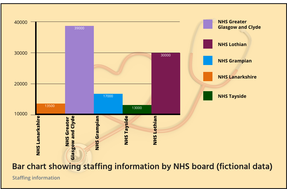
Figure 2. Example of what not to do
Example of poor alt text
Data chart showing staffing information across NHS boards with coloured bars and a legend.
Why this alt text is poor
- describes the appearance of the chart rather than the insight
- does not explain the key message
- does not identify the most important values
- provides little value to screen reader users
Why this chart does not work
The column chart in Figure 2 introduces unnecessary complexity because it:
- uses a confusing reading order
- applies the categorical colour palette in a random order
- places the bars in a random sequence, making comparisons difficult
- starts the y-axis above zero, exaggerating differences between values
- emphasises category labels instead of the data values
- rotates labels vertically, making them harder to read
- aligns labels away from the centre of the bars, making it harder to identify which label belongs to each category
- omits thousands separators, making large numbers harder to interpret
- uses a vague title and subtitle that do not explain the data
- adds a redundant legend even though the categories are already labelled
- places values inside bars using colours that are difficult to read
- uses a low-contrast background that reduces readability
- adds decorative graphics that distract from the data
- uses heavy axis lines that compete with the chart data
- surrounds the chart with a border that adds visual clutter